Case Study 1
Santo Wines is a mobile booking redesign helping users reserve wine experiences with more clarity, trust, and confidence.
Impact
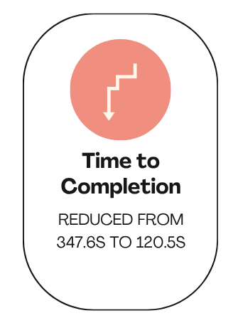
65.3% faster completion
Users completed the final prototype significantly faster, suggesting the redesigned flow reduced cognitive load and made the booking journey easier to follow.
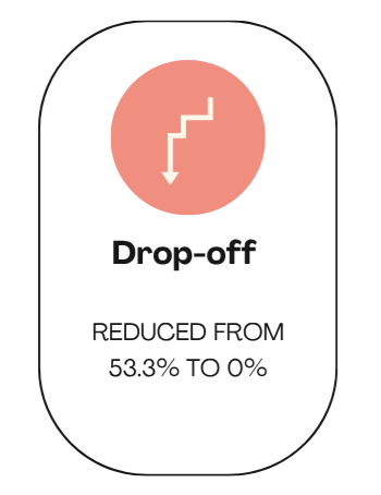
0% drop-off
The final prototype removed the abandonment seen in the original flow by clarifying key decision points and improving user confidence.
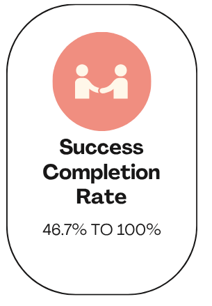
100% completion rate
All users in the final round completed the booking task, compared with less than half on the original experience.
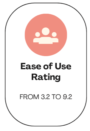
9.2/10 ease of use
Users rated the redesigned experience as much easier to use, reflecting improvements in hierarchy, feedback, and overall clarity.
Project Overview
Context: Santo Wines’ mobile booking journey was causing users to hesitate and drop off before completing a reservation. Users lacked confidence when choosing seats, understanding pricing, reviewing confirmation, and moving into payment.
Goal: Redesign the mobile booking flow to make the process clearer, faster, and more trustworthy for users.
My Role: UX Researcher and Designer — project management, research, wireframing, usability testing, UI design, and prototyping.
Tools: Figma, FigJam, Maze, Google Suite, Relume, Loveable,
Timeline: 9 weeks
The
Challenge
Users needed to feel confident that their booking was correct, secure, and confirmed.
The original booking flow:
Made it difficult to identify where to start booking.
Hid important actions and confirmation states.
Introduced pricing without enough context.
Created uncertainty around payment and trust.
Asked users to process too much information at once.
Problem:
How might we redesign the Santo Wines mobile booking journey so users can complete a reservation with less hesitation and more confidence?
Project Goals
The redesign focused on three priorities:
Reduce abandonment
Make it easier for users to complete a booking without dropping off during seating, pricing, or payment.Increase user confidence
Give users clearer feedback so they understand what they selected, where they are in the process, and when their booking is confirmed.Simplify the booking journey
Break the flow into smaller, more manageable steps to reduce cognitive load and make the experience feel faster.
Research
A parallel mixed-method approach was implemented.
The following were conducted:
Discovery survey
Competitor analysis
Heuristic evaluation
Remote usability testing
Heatmap and click-path analysis
Post-task ratings and feedback
Discovery
Survey
We surveyed 86 participants with 27 questions about their restaurant booking habits, expectations, and concerns.
The survey showed that users hesitate or avoid booking when they experience:
Unclear pricing
Uncertainty around booking confirmation
Payment security concerns
Cancellation or refund worries
Fear of rigid schedules
Not knowing the quality, menu, or atmosphere
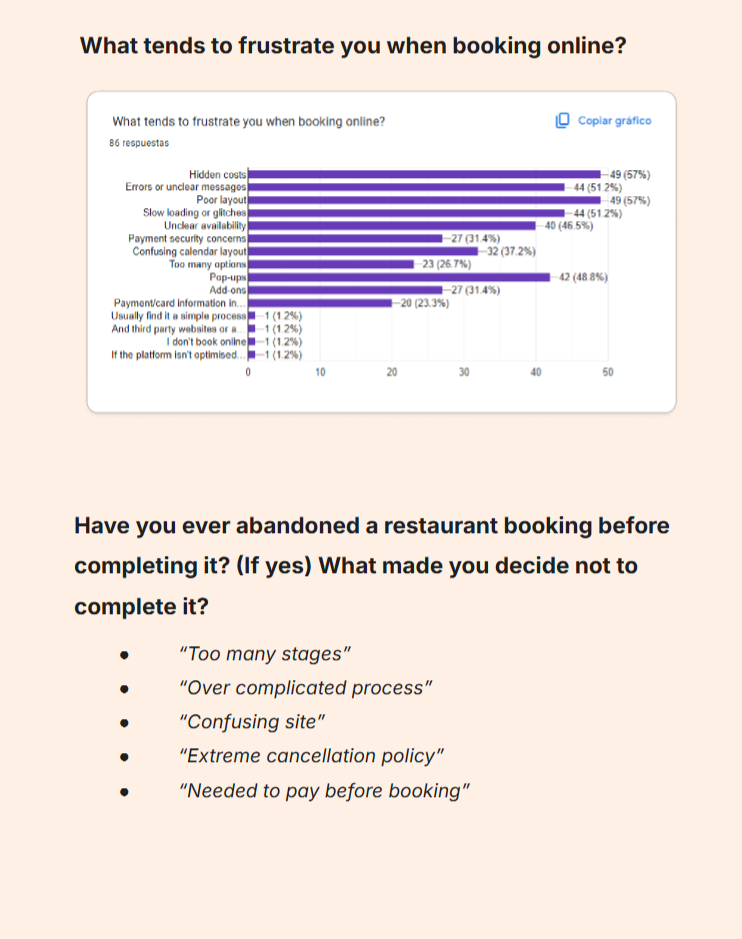
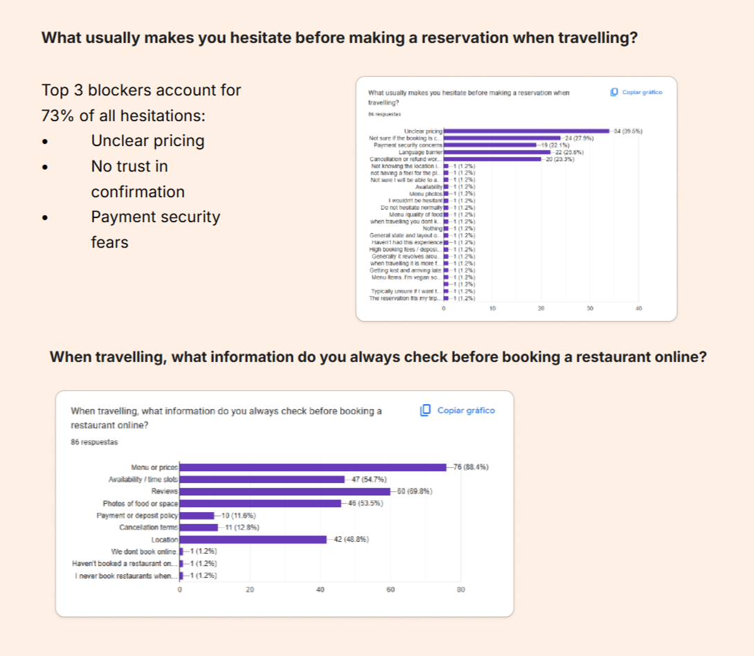
The discovery survey helped us understand broader booking behaviours and concerns.
What we learned:
Users needed clear pricing, visible confirmation, and reassurance before reaching payment.
Market Analysis
I reviewed established booking platforms, including The Fork, to understand familiar booking patterns, trust signals, and how other platforms communicate pricing and availability.
Why this mattered:
Restaurant booking platforms already have common conventions. If Santo Wines’ flow moved too far away from these patterns, users were more likely to hesitate.
What we learned:
Conventions show that booking flows display clear availability, pricing, progress, and confirmation before payment.
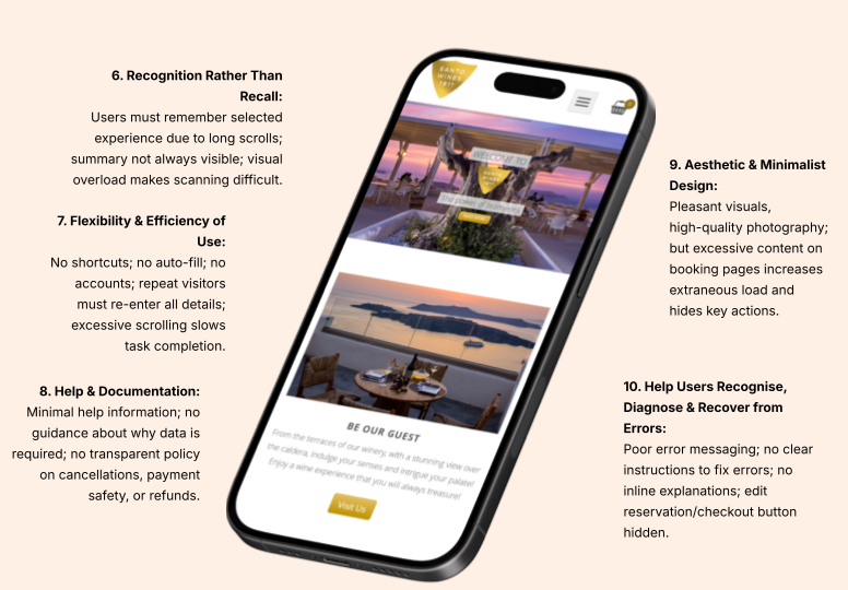
Heuristic
Audit
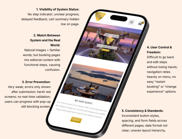
I audited the existing mobile experience using usability principles, focusing on system feedback, consistency, user control, and error prevention.
Why this mattered:
The site needed to communicate clearly when users made selections, moved between steps, or completed a booking.
What we learned:
The flow lacked strong feedback at key points. Users could not always tell whether their selections had been saved or whether the booking was progressing correctly.
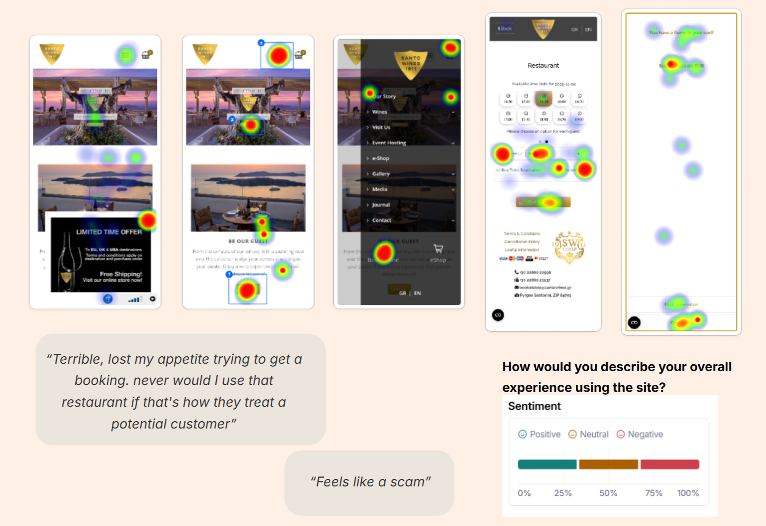
Usability
Testing
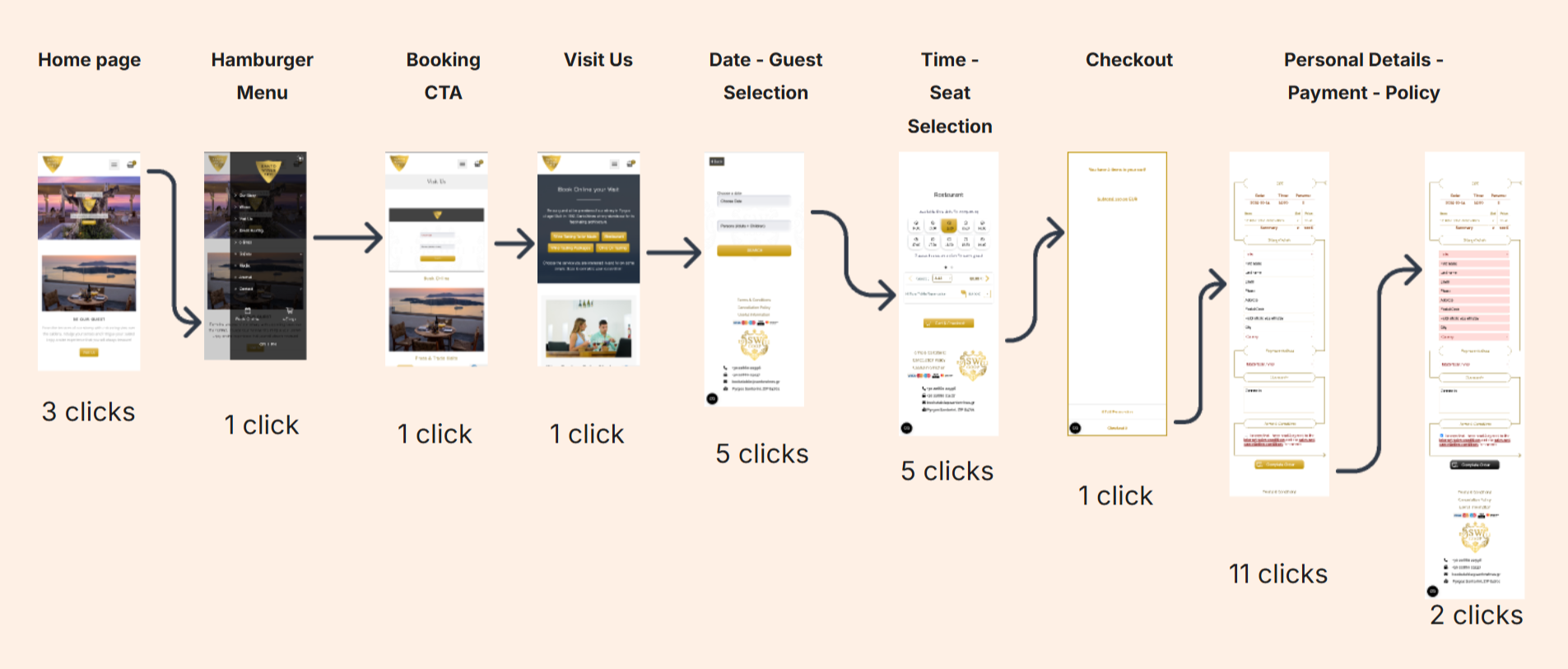
We created a replica of the existing website and tested it through remote, mission-based usability testing in Maze. This allowed us to observe click behaviour, task success, drop-off points, and user confidence.
Why this mattered:
We needed behavioural evidence and authentic feedback.
What we learned:
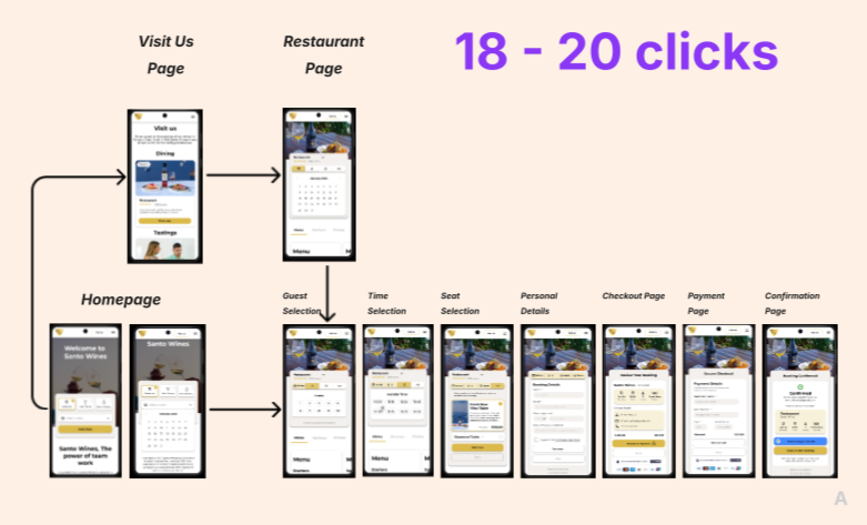
Users struggled to identify the correct booking entry point.
The total minimum clicks necessary amounted to 27.
Heatmap analysis showed first clicks around the hamburger menu rather than the intended booking CTA, suggesting that the primary booking action was not obvious enough.
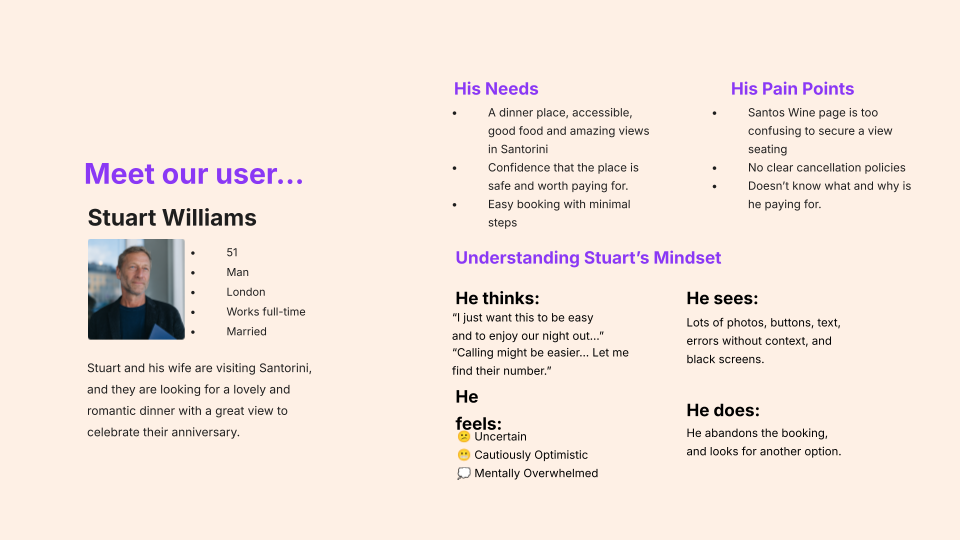
User Persona
Design Process
I translated the research insights into design requirements:
Clear booking entry point → easier task initiation.
Step-by-step flow → reduced cognitive load.
Visible progress indicator → stronger system feedback.
Clearer pricing information → improved transparency.
Trust signals near payment → increased confidence.
Confirmation screen → reassurance after booking.
Iterations:
Early wireframes explored different ways to bring booking closer to the homepage.
Layouts tested menus, widgets, pop-ups, steppers, and booking cards.
The final direction used a widget-based booking flow with a stepper to guide users through each decision.
User Flow
Key Stages in the Flow
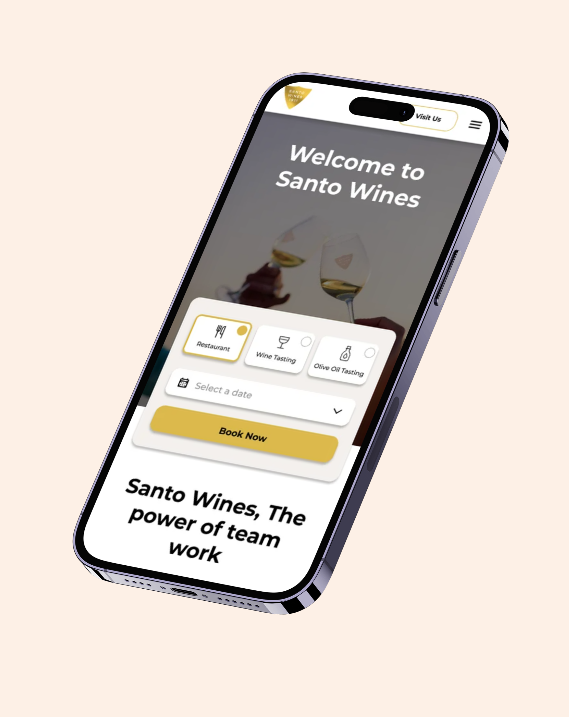
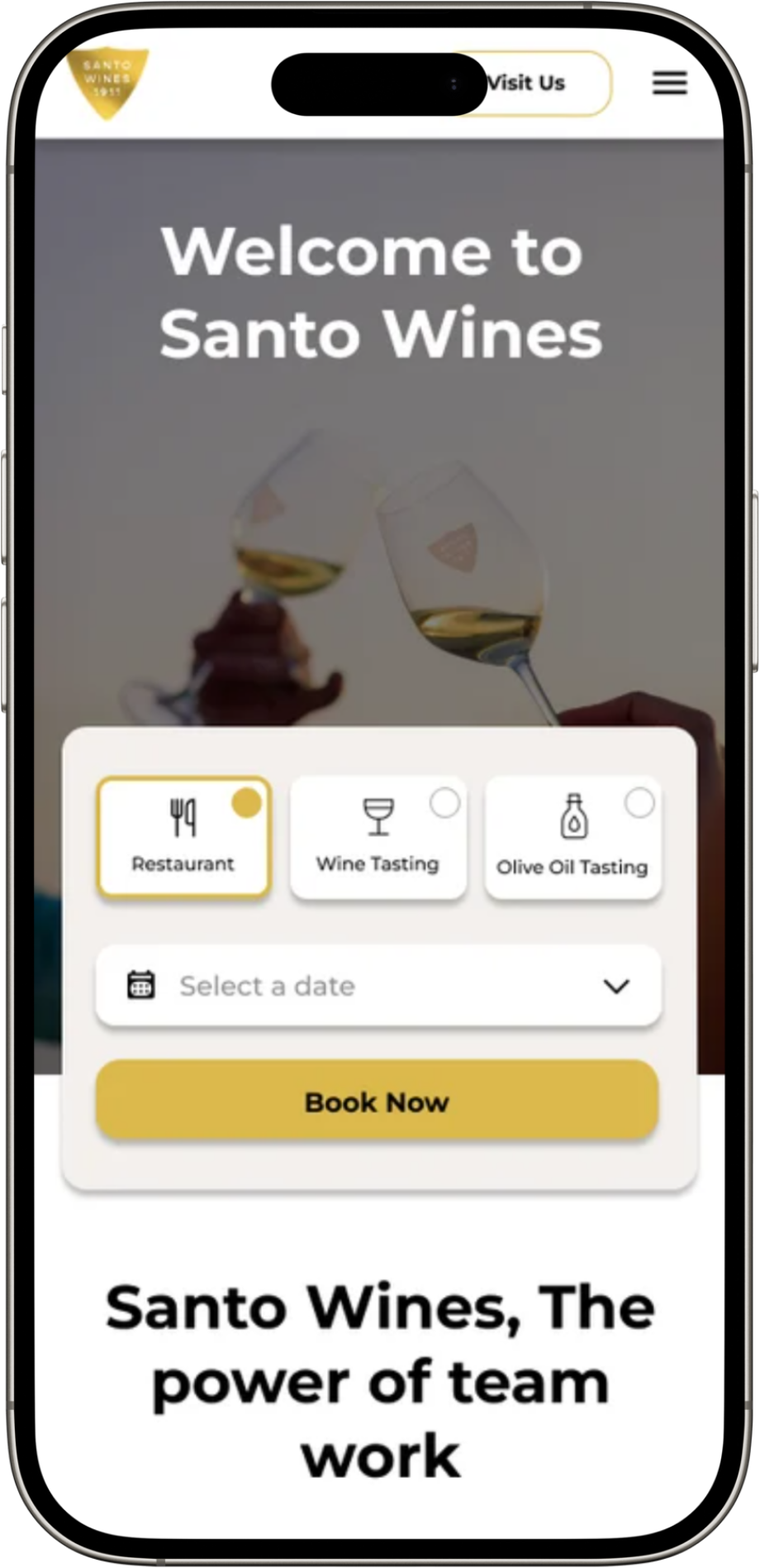
Homepage & Booking Widget – Users can begin booking directly from the homepage without searching through the navigation.
Select Date, Time & Guests – The flow separates decisions into smaller steps so users are not overloaded.
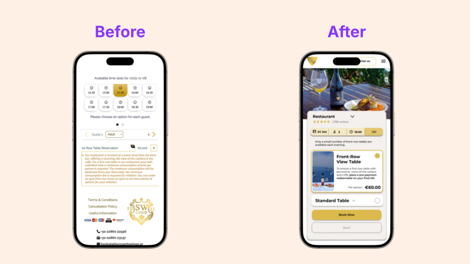
Choose Seating – Seating options are presented more clearly, with pricing and availability easier to understand.
Review Booking – Users can check their selections before payment.
Payment & Confirmation – Trust signals and confirmation feedback reassure users that the booking has been completed.
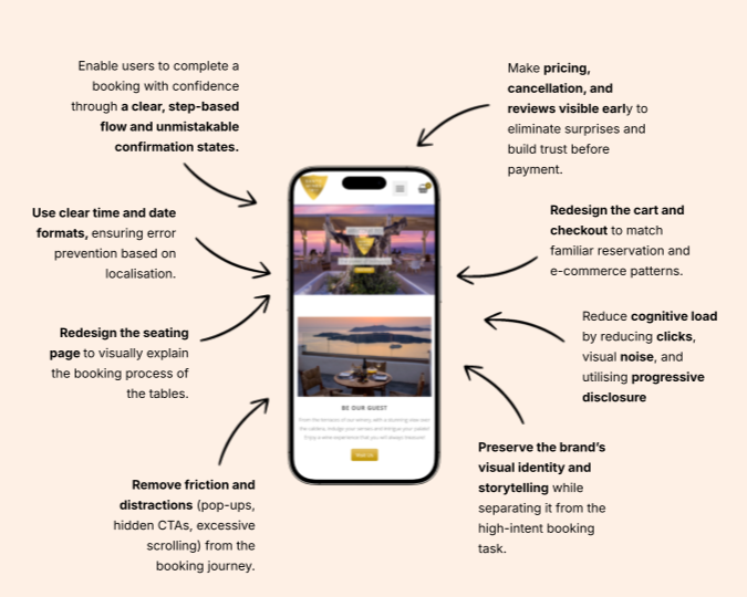
Design Considerations
Clarity of actions: Making the booking CTA more visible reduced hesitation.
Trust and transparency: Pricing, policies, and payment reassurance were surfaced earlier.
Progressive disclosure: Breaking the journey into steps reduced cognitive load.
System feedback: The stepper and confirmation screen helped users understand their progress.
Design
Goals
Our goal was to design the booking experience as a focused, step-by-step task flow that prioritizes clarity, familiar patterns, and transparent information over storytelling and upselling.
Homepage
Redesign
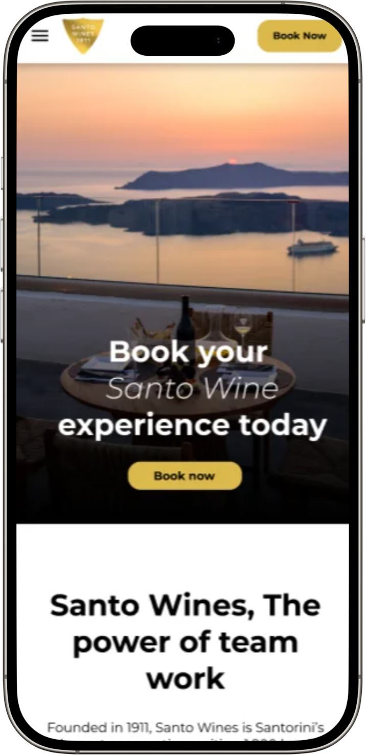
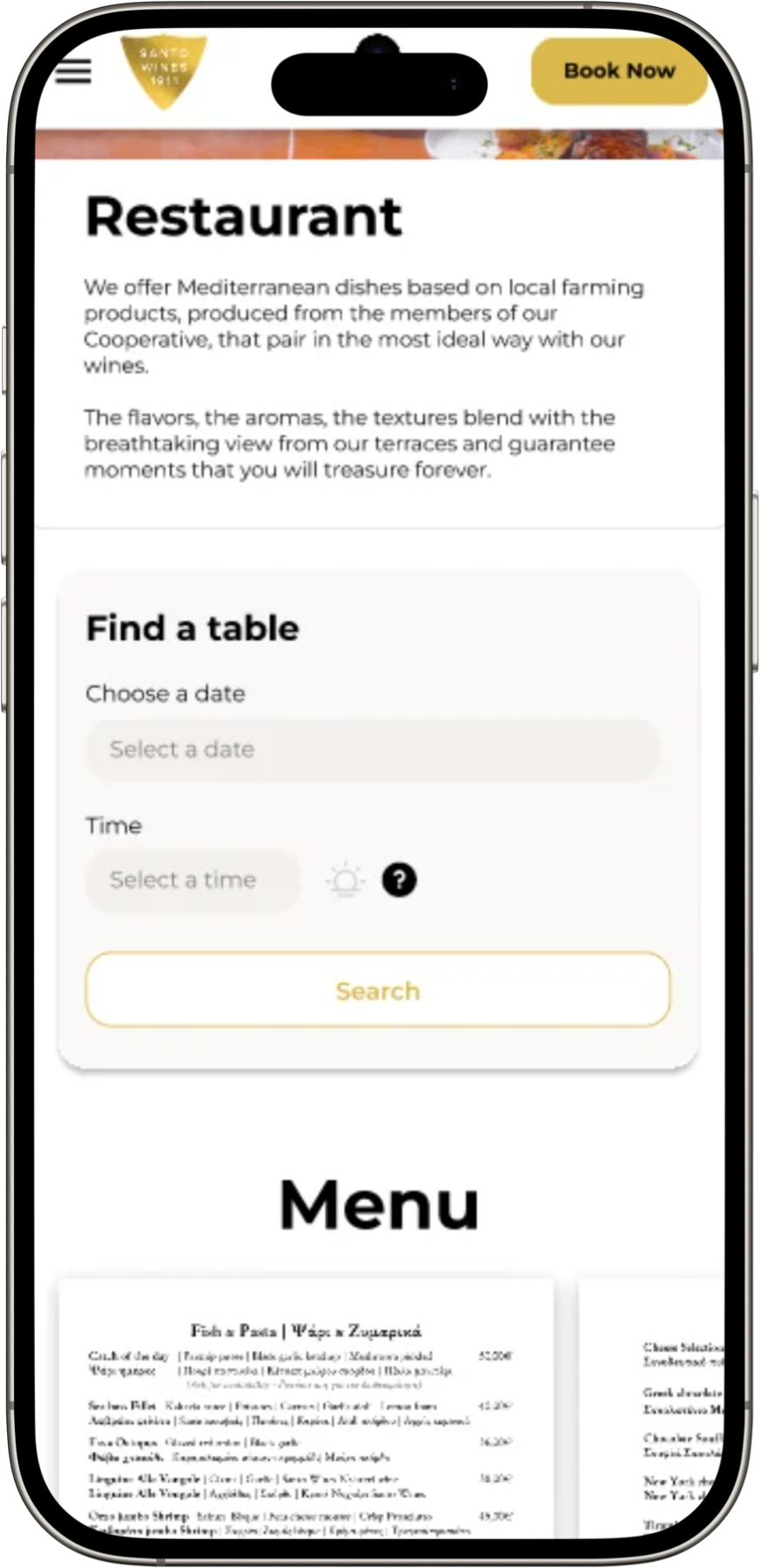
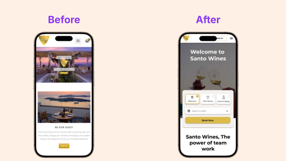
The first homepage iteration improved visibility by bringing the booking action closer to the main landing experience.
The original homepage made users work too hard to find where to book. In the first iteration, we brought the booking action closer to the homepage, which improved access to the flow. However, testing showed that users still needed clearer guidance at the point of entry.
Users could now reach the booking flow more easily, but the homepage still needed clearer prioritisation. The booking action competed with surrounding content, which meant some users still paused before starting the task.
In the final iteration, we made the booking widget more prominent, simplified the surrounding layout, and strengthened the call-to-action so users could start the booking journey with less hesitation.
Instead of asking users to search through the navigation or scan surrounding content, the redesigned homepage introduced a clearer booking widget with a stronger call-to-action.
This helped align the page with the user’s main goal: quickly checking availability and beginning a reservation.
What improved:
The booking entry point became more visible.
The CTA hierarchy was clearer.
Users had a more direct route into the booking flow.
The homepage supported booking intent instead of competing with it.
The interaction felt more actionable and less exploratory.
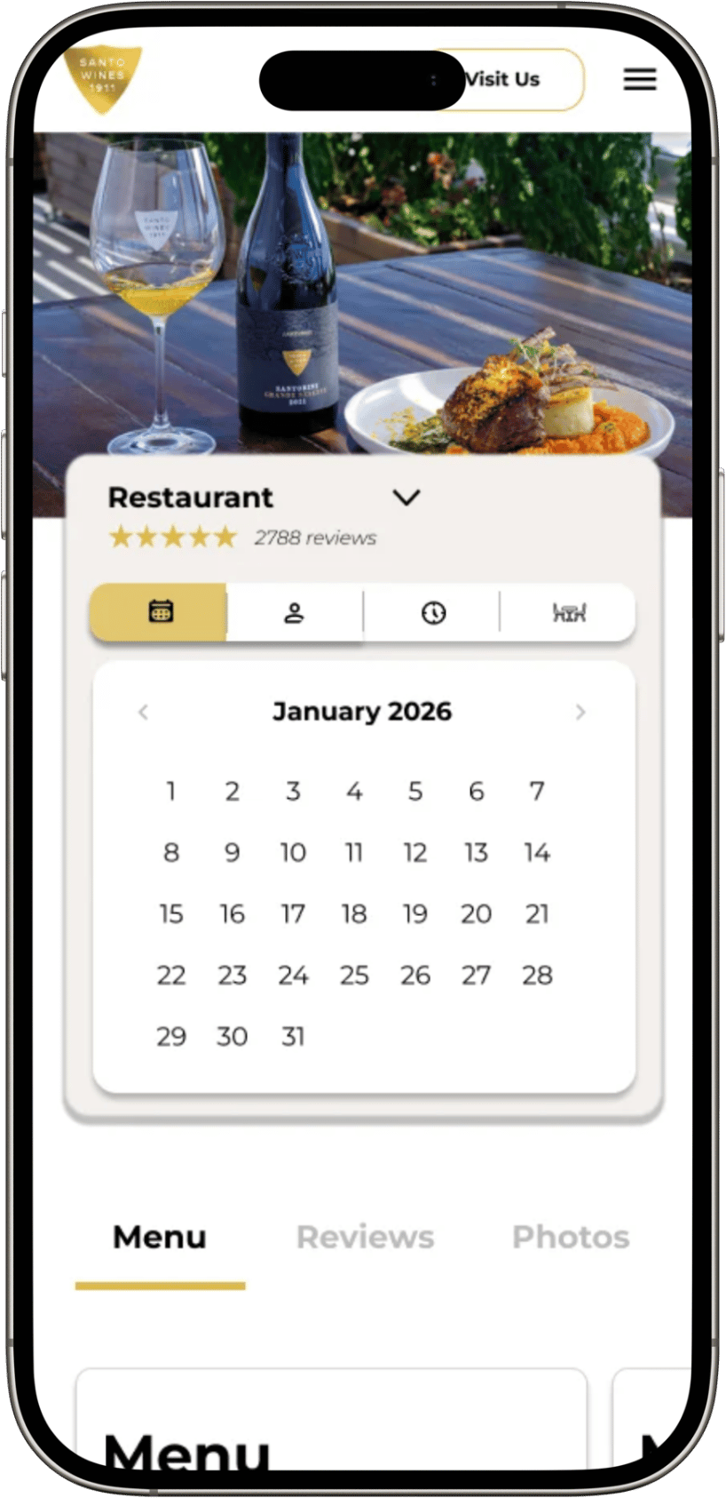
Booking Page
Redesign
The first booking page iteration introduced a more structured reservation flow, but testing showed that users still needed clearer guidance when making key decisions.
Users were being asked to choose dates, times, guest numbers, seating options, and pricing details within a dense flow. This made the booking task feel more complicated than it needed to be and caused some users to pause or re-check their selections.
The main issue was that users did not always understand what they had selected, what would happen next, or whether pricing had been clearly explained before moving forward.
Instead of presenting the booking task as one dense interaction, the final version broke the journey into smaller decisions using progressive disclosure.
The stepper gave users a clearer sense of progress, while simplified seating options, clearer pricing, and stronger calls-to-action helped users understand what they were selecting and what to do next.
The menu - review - photos cards allowed users to swipe or tap to view these sections without opening a new tab or being brought away from the booking widget.
The menu was also added as text rather than a PDF or PNG file so that screen readers could function seamlessly.
What improved
The booking flow was broken into clearer steps.
The stepper made progress more visible.
Seating choices became easier to compare.
Pricing was communicated earlier and more clearly.
CTAs were more visible and action-oriented.
Users had stronger confirmation that they were progressing correctly.
The final booking page used a clearer step-by-step structure to reduce cognitive load and help users move through the reservation with more confidence.
What improved:
Time-to-completion decreased by 65.3%
Completion rate increased from 46.7% to 100%
Drop-off reduced from 53.3% to 0%
Ease of use increased from 3.2 to 9.2
Likelihood of using the booking site again increased from 2.8 to 9
The biggest improvement was not just visual. The redesigned journey gave users clearer information at the moment they needed it.
The results showed that the redesign did more than improve the visual interface. It reduced uncertainty throughout the booking journey by clarifying the entry point, progress, pricing, and confirmation.
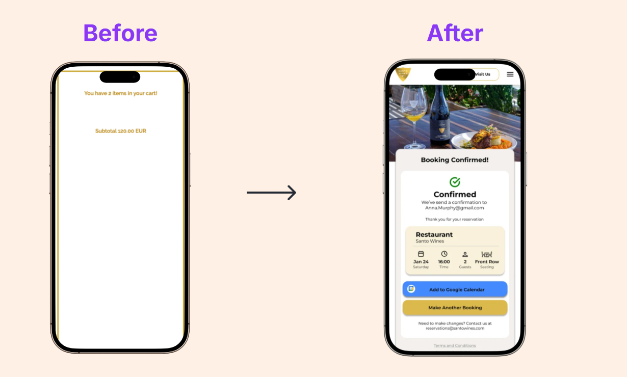
The redesigned confirmation page
The redesigned seating page
The redesigned homepage
Results
In a usability test, the sentiment of trust was greatly improved to 100% of users having a positive reaction to trust of the booking system.
The redesigned prototype showed a clear improvement in task success, speed, and user confidence.
Take Away
What was achieved:
Improved the mobile booking experience using research and usability testing.
Made the booking journey clearer and easier to start.
Reduced cognitive load by breaking the process into smaller steps.
Increased trust through clearer pricing, confirmation, and payment reassurance.
Improved task completion and reduced drop-off in prototype testing.
Next steps:
Further usability testing with a wider participant group
Accessibility testing across the full booking journey
Exploring upselling opportunities within the booking flow
Testing the design on desktop and tablet
Running A/B testing on different booking entry points