Case Study 1
BetterLiving is housing platform concept helping Dublin students find safe, affordable, and lifestyle-matched accommodation.
Project Overview
Context: Dublin’s student housing market is stressful: with rising rents, scams, and limited compatibility features, many students struggle to find safe, suitable homes.
Goal: Create a rental platform that prioritises trust and inclusivity, helping students feel confident when choosing accommodation.
My Role: UX Designer (research, wireframing, UI design, and prototyping).
Tools: Figma, Miro, Google Suite
Timeline: 3 weeks
The Challenge
Students don’t just want a room: they want a safe, affordable, and compatible place to live.
Current platforms:
Emphasise price and location, but overlook lifestyle fit.
Fail to build trust (unverified landlords, vague listings).
Lack clarity in browsing and booking flows.
Problem Statement: How might we design a platform that makes the student housing process transparent, trustworthy, and student-friendly?
Research
Trust is critical: students fear scams and need reassurance.
Ease of communication: most rental searches and communication happen on phones or laptops via multiple channels such as website, email, text, call, and apps.
Key insights
Compatibility matters: flatmate fit is as important as rent.
Simplicity wins: students want quick, uncluttered browsing, and having all communication on one app.
I focused on understanding students’ pain points through a mix of desk research and informal feedback.
User Empathy Map

User Persona

Design Process
I translated insights into design requirements
Verified landlords → trust.
Lifestyle filters → compatibility.
Clear messaging → safe communication.
Clean UI → cognitive ease.
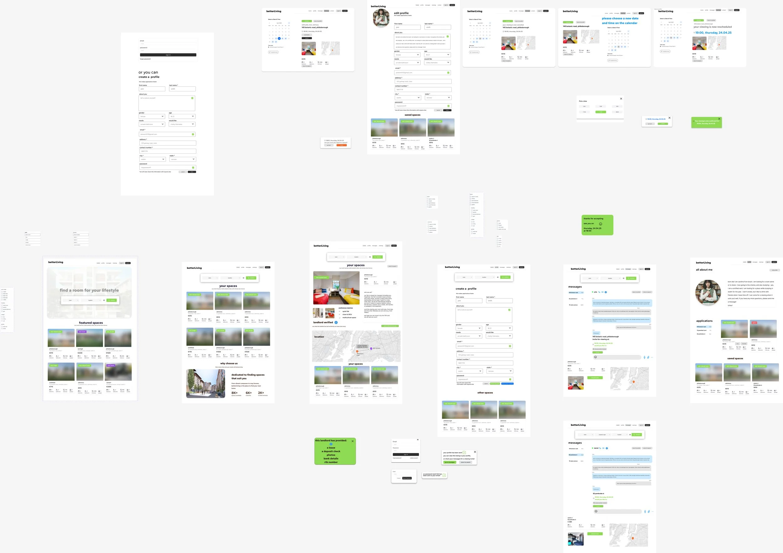
Iterations
Early wireframes tested filter placement and landlord badges.
Adjusted flows to prioritise verified profiles and preference-based search.
Integrated messaging to reduce scams and move away from third-party apps.
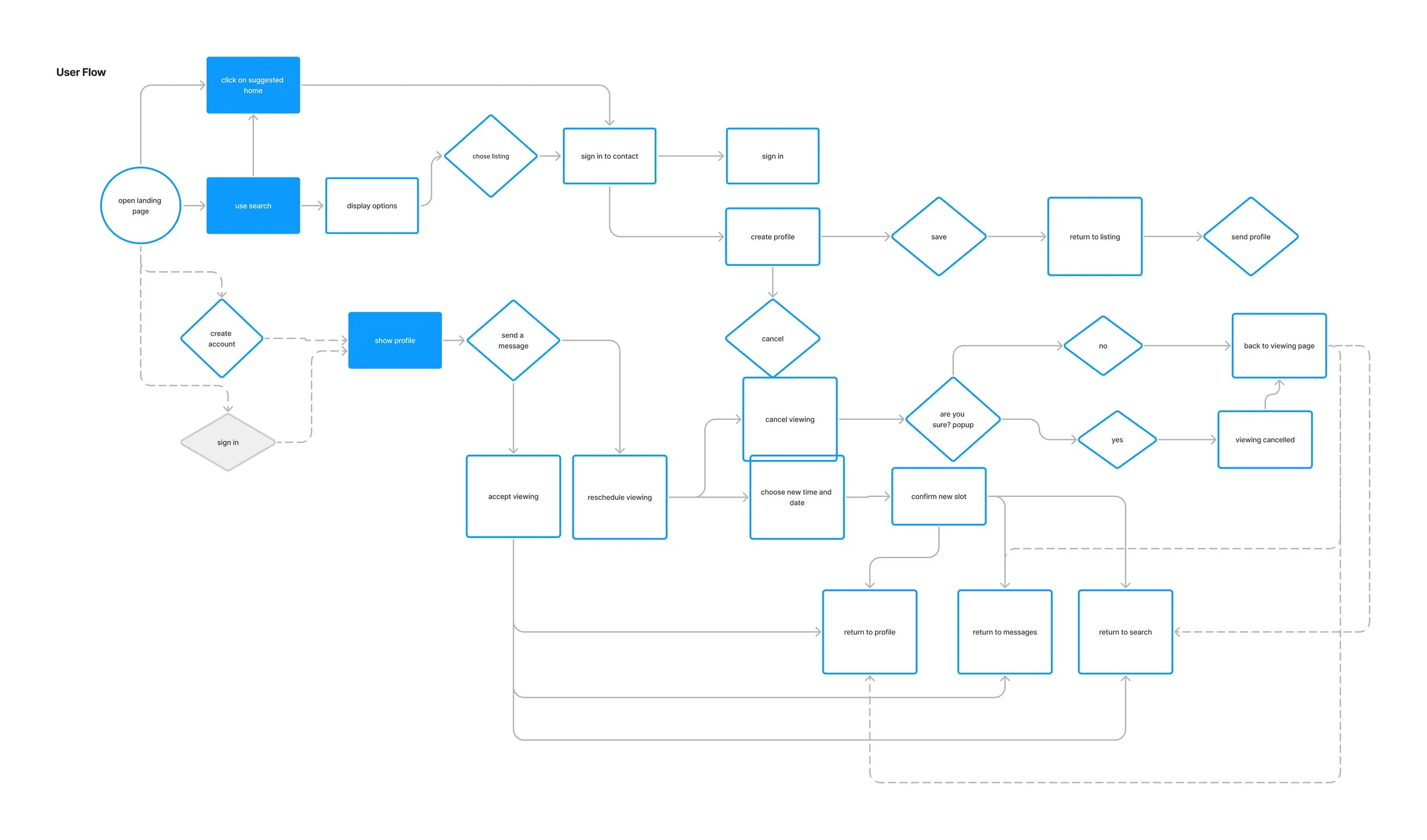
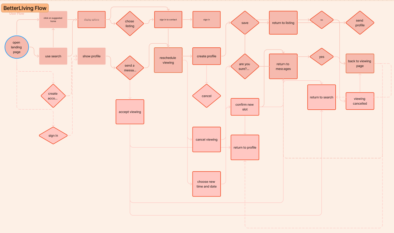
User Flow
Key Stages in the Flow
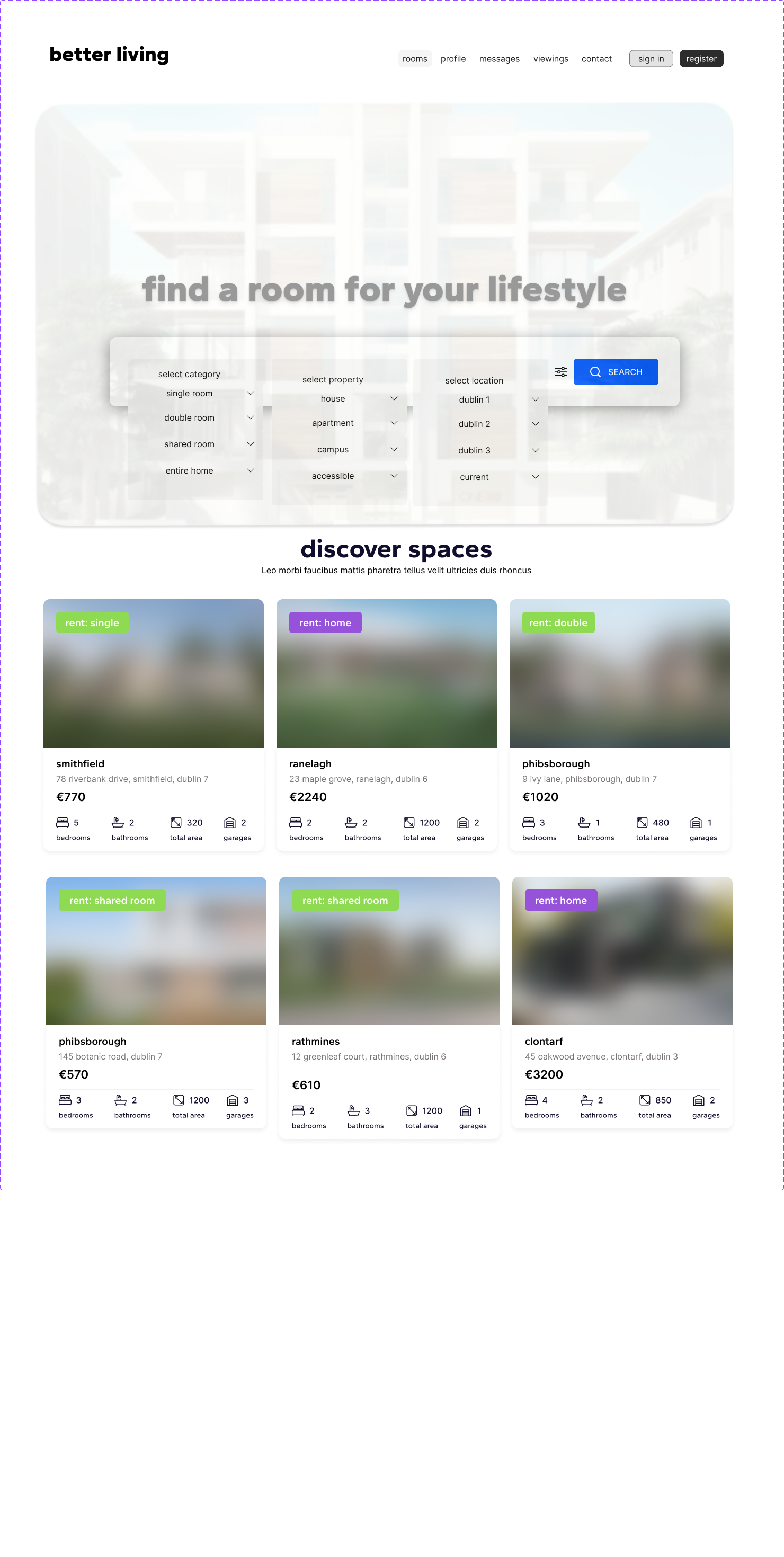
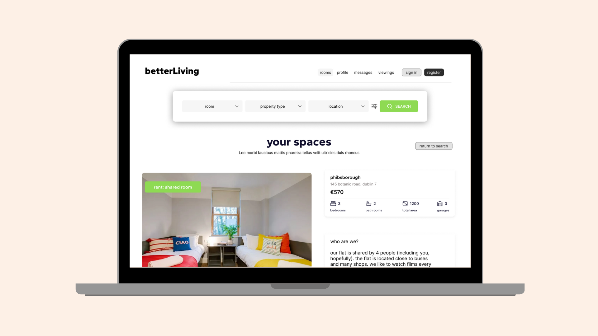
Landing & Search – Users can explore suggested homes or refine results with filters.
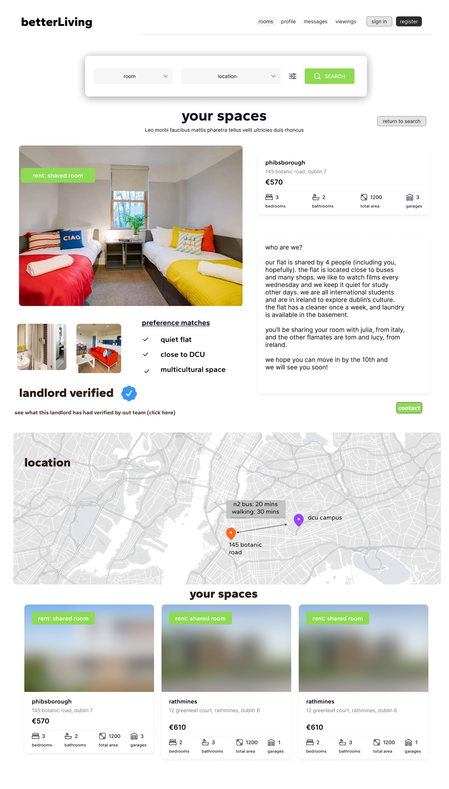
Explore Listings – Detailed listing pages highlight photos, lifestyle tags, and verified landlord information.
Contact & Messaging – A single “Contact” button streamlines outreach, leading to an in-app chat.
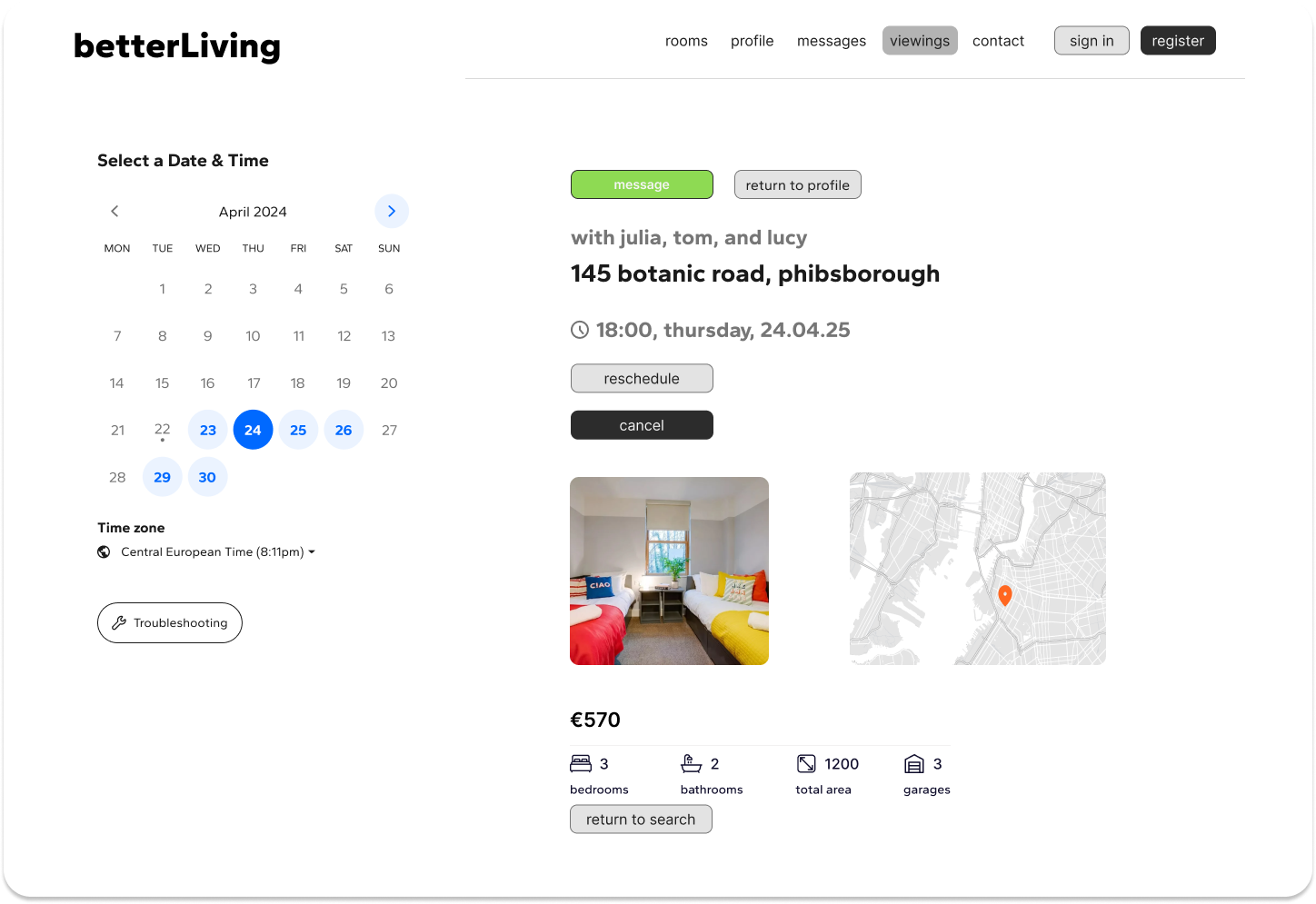
Viewing Management – Within messages, students can accept, reschedule, or cancel viewings with clear confirmation states.
Profiles & Trust Features – Users can create a profile, save listings, and see “landlord verified” badges to build confidence.
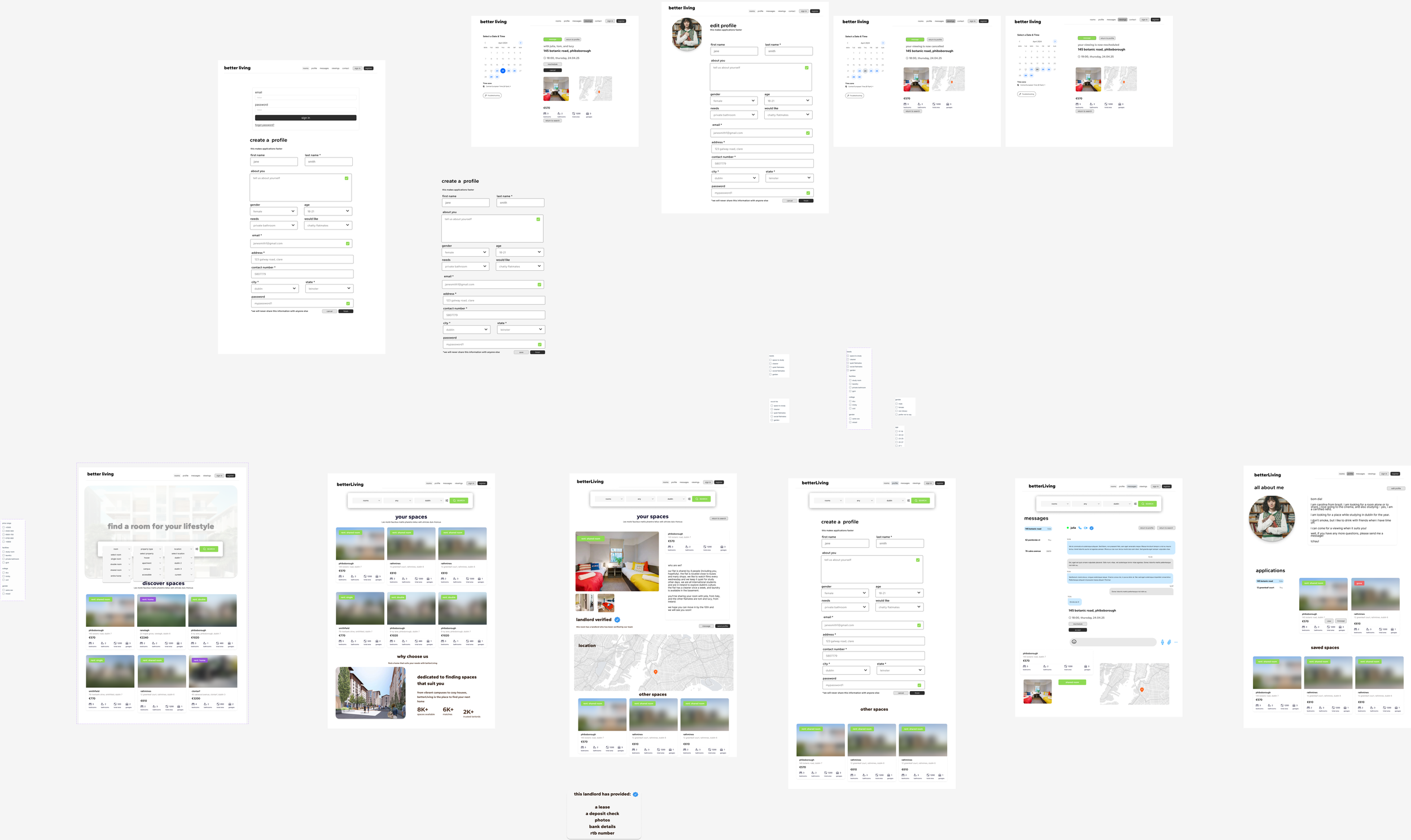
The user flow for BetterLiving was designed to reflect the end-to-end journey of a student searching for accommodation, from discovery to viewing confirmation.
Design Considerations
Clarity of actions: Simplifying multiple CTAs into one (e.g. “Contact”) reduced hesitation.
Trust & transparency: Verified landlord and preference-matching features were integrated into the flow.
Flexibility: Students can reschedule or cancel viewings directly in chat, reducing friction.
Homepage Iteration
First iteration: an inclusive property search bar allowing students to choose by room type, property type, and location.
Features:

“I wouldn’t use the property type filter!
I just care about where it is and how much it costs.”
— Student participant
During early feedback sessions, students found the property type filter confusing.
Most did not use it, and some weren’t sure what the difference between options (like house vs. apartment) meant in this context.
Instead, they prioritised location and room type.
In response, the property type filter was removed.

Final iteration: The revised design streamlined the search bar to focus on room type and location, making the experience more intuitive and aligned with real student priorities.
By removing unused options, the search became cleaner and faster, reducing cognitive load for first-time users.
This change reflects how small iterations, which are grounded in research, can have a big impact on usability.
Listing Page
Iterations
First Iteration: In the original listing page, users had two separate options: “message” or “sign in to send profile.”
Features:

This caused hesitation, because new users weren’t sure which action they needed to take.
Students wanted a single, clear action. They didn’t want to decide between messaging and sending a profile — they simply wanted to contact the landlord/flatmates directly.
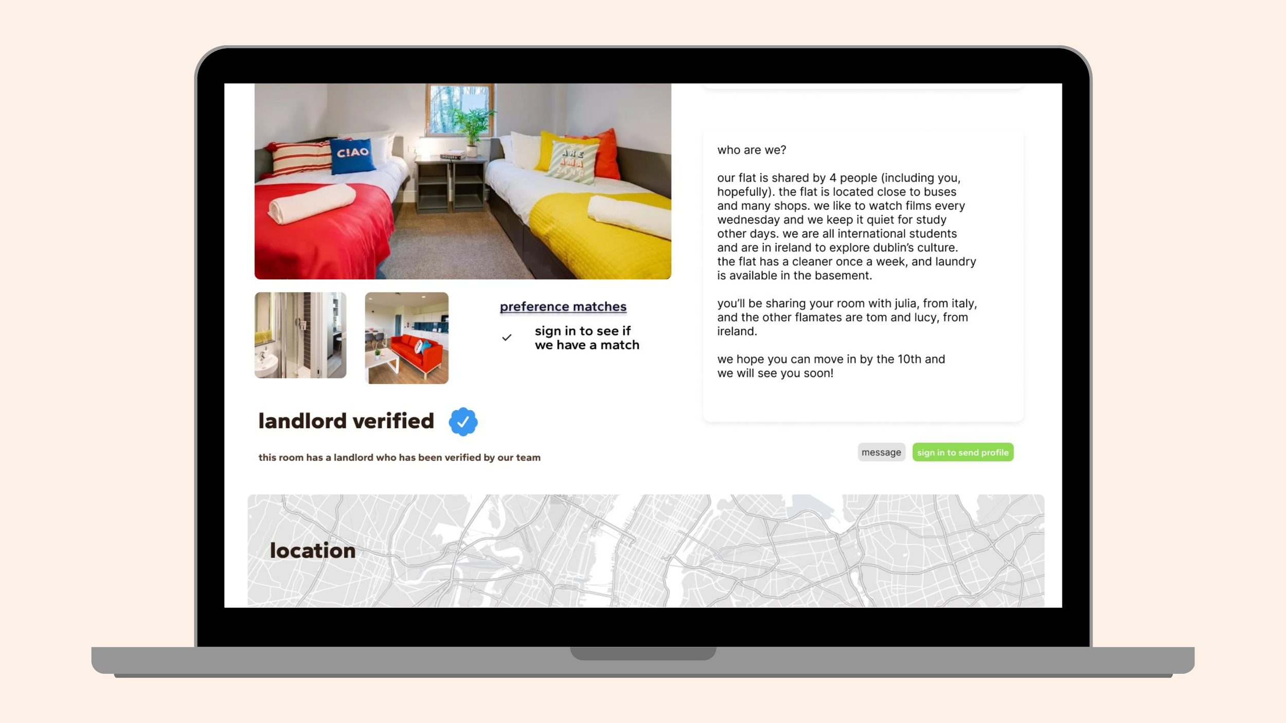
Some feedback suggested that having both buttons created unnecessary complexity.
“I just want one button that lets me reach out… why do I need to pick?”
— Student participant
This change reduced cognitive load, made the platform feel more intuitive, and aligned with the principle of progressive disclosure — giving users just the information they need, when they need it.
This reduced confusion and made the interface feel more approachable.
Final Iteration: The buttons were simplified into a single “Contact” action, streamlining the process

Contact Page Iterations
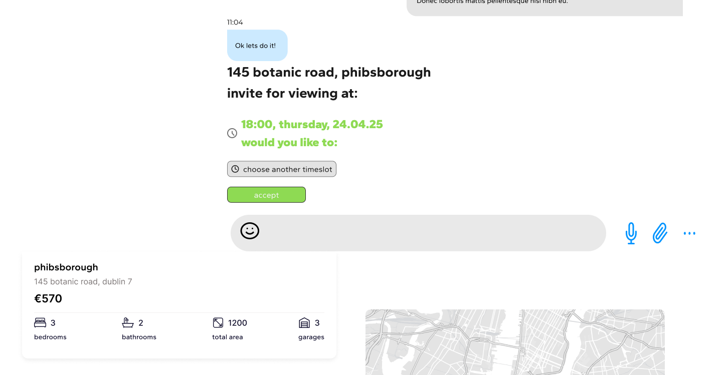
First Iteration: The original messaging page allowed users to chat with landlords/flatmates and see scheduled viewing details.
Features:

However, the confirmation flow relied on grey/black buttons (“reschedule” / “accept”) and a subtle notification.
Users reported being unsure if their viewing was confirmed, as the color scheme and language didn’t communicate status clearly.
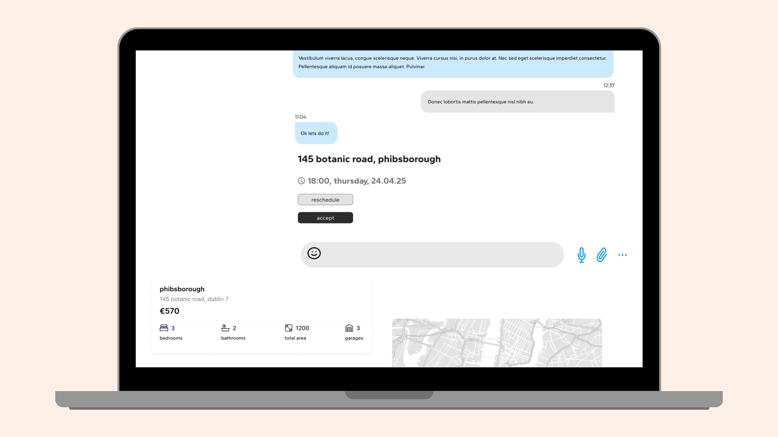
“I don’t know if it’s actually confirmed. It just looks like another message.”
— Student participant
Testers highlighted that:
The color palette didn’t signal “confirmation” vs “pending.”
The wording (“reschedule” / “accept”) didn’t feel action-oriented enough.
Users expected a stronger visual confirmation (e.g., green = confirmed).
Final Iteration: The revised design used a green highlight and stronger confirmation text, making the flow more reassuring.

“Invite for viewing” is shown prominently.
Confirmed times are displayed in green with clear labels.
Users are offered clear options: “accept” or “choose another timeslot.”
By clarifying state changes with color and stronger feedback, the experience now feels more reliable. This small change directly addressed user anxiety about whether they had secured a viewing.
Take Away
What was achieved:
Improved user experience based on real feedback
Enhanced trust with verified landlords and clearer communication with housemates
Made viewings and messaging more intuitive and centralised the site
Next steps:
Further user testing with larger groups
Expanding verification features
Adding a housemate compatibility tool as an optional feature
Encryption of messaging to add layer of trust and safety